Introduction
Patterned fabrics and colors can create a statement in any outfit. By combining different patterns and colors, it can be easy to create individual and fun casual looks. Mixing prints and colors can seem daunting, but once you know the basics of color theory and how to coordinate them, it can be both fun and exciting.
From creating harmonic color schemes to building monochromatic looks, there’s a lot to consider when mixing patterns and colors. In this guide, we will discuss the basics of color theory, tips on choosing the right colors and patterns, how to put together playful looks, and stylist tips for making a statement. By following this guide, you’ll be able to create fun and playful casual looks that make a statement.
What are Patterned Fabrics and Colors?
Patterned fabrics and colors are a fun way to add visual interest to an outfit. Patterns, such as stripes, polkadots, and florals, are created by contrasting colors and shapes. Colors can be bright and bold for a fun look, or muted and subtle for a more sophisticated style. Mixing patterns and colors can be a great way to have fun with your wardrobe and create a unique outfit that stands out from the crowd!
Mixing patterns and colors is an exciting way to add a unique touch to your look. By boldly combining different designs and hues, you can create interesting – and even eye-catching – outfits that will definitely turn heads. Not only does this style allow you to express yourself creatively, but it also has the potential to make any ordinary outfit look extraordinary.
There are plenty of advantages to mixing patterns and colors. For one thing, it has the power to visually expand a look to make it look larger than it actually is. This is great news for those who want to create an impressive look without buying a bunch of expensive clothing. Furthermore, when done right, this style provides a unique and polished approach to fashion that stands out from the crowd. Finally, it’s also a great way to show off your sense of style and personality in a fun and playful way.
Mixing patterns and colors can be a fun and creative way to add some personality to your wardrobe. With the right knowledge and tips, anyone can create looks that are sure to turn heads. Doing so can have several benefits, such as:
- Achieving greater balance in an outfit
- Making unique pieces with different prints
- Finding new ways to express yourself through fashion
- Adding more depth and interest to an outfit
- Making outfits stand out in the crowd
Mixing patterned fabrics and colors is an exciting journey of self-expression and creativity. By following the tips laid out in this guide, you’ll be able to find the perfect balance between colors and patterns to make any casual look playful and fun.
Basics of Color Theory
Understanding which colors go together and how to create a harmonious, aesthetically pleasing and striking color scheme can be quite an intimidating task. However, once you understand the basics of color theory, it’s really quite simple.
Color theory is the study of how colors interact, how they’re combined to create visuals, and how this impacts how the individual perceives them. By understanding how colors work together, you can create the perfect outfits for any occasion.
How to Create a Harmonious Color Scheme
The most popular way to create a harmonious color scheme is by using the color wheel. This visual tool divides all the colors into two groups based on their type; primary colors (red, yellow, blue) or secondary colors (purple, orange, green). From there, you can use the cool and warm colors to create the right contrast.
Understanding Tones and Shades
In addition to understanding the color wheel, it’s important to know the difference between tones and shades. Tones are colors with different levels of saturation, from light to dark, while shades are colors with either black or white added. Both can be used to mix and match patterns and colors to create fun and playful looks.
How to Create a Harmonic Color Scheme
Creating a harmonious color scheme is an important starting point when it comes to mixing patterns and colors. It’s crucial to understand the basics of color theory in order to make sure you’re matching shades that go together well. In a simplified way, colors can be separated into two categories: warm and cool. Warm colors such as yellow, orange, and red evoke feelings of joy, while cool colors like blue, green, and purple tend to be calming.
The next step in creating a harmonious color scheme is to learn about the color wheel, which are a set of primary, secondary and tertiary colors arranged in a circle known as the color wheel. Primary colors are red, blue, and yellow. When these are mixed together they create the three secondary colors, which are green, orange, and purple. And when these are further mixed together they create different shades of tertiary colors such as yellow-orange, blue-green, etc.
Using the color wheel, you can create coordinating color schemes using colors that are next to each other or opposite to each other in the wheel. Monochromatic color schemes consist of one dominant hue and its’ shades. Analogous color schemes feature colors that are next to each other. Complementary color schemes feature colors that are opposite from each other. And Triadic color schemes combine three colors that are evenly spaced around the wheel.
Understanding the basics of the color wheel will help you know which colors are complimentary and how to mix them to create interesting combinations. It’s important to note that this is just the start. You can always add texture, prints, and whitespace to add more depth to your outfit!
Understanding Tones and Shades
Tones and shades are variations of a single color. Tone is when white light is added to a hue, resulting in a lighter shade of the same color. Shade, on the other hand, is when black is added to a hue, resulting in a darker version of the same color.
This simple change can create an entirely different look, making colors feel warm or cool, depending on the amount of white and black used to adjust the tone. This is why it’s important to understand the difference between tones and shades as you mix patterns and colors.
When working with colors, it helps to have a basic understanding of the color wheel. This will help you understand the relationship between different colors and the effects they will create when combined. As an example, combining colors that are opposite each other on the wheel (like blue and orange) is considered complementary and will create vibrant and energetic results.
Choosing the right patterns and colors for your outfit can be a daunting task. It can be difficult to know what type of combination will look best. However, with some basic knowledge about color theory and pattern matching, you can create unique and stylish casual looks.
To begin, you must understand the basics of color theory. Understanding tones and shades of different colors will help you create harmonious color combinations that work together. You can also use a color wheel to determine complementary colors to create contrast in an outfit. Another important factor when selecting colors is knowing the visual weight of the pattern- this tells you how much space the pattern will take up visually.
Once you have the fundamentals down, you can start to mix patterns and colors. One way to do this is by combining horizontal and vertical patterns. This creates an interesting contrast that is eye-catching. Another option is to mix complementary colors in small doses. To make an even more powerful statement, you can combine prints of different sizes. Despite being a bit more daring, this can often produce very stylish looks.
For more formal occasions, a monochromatic look or subtle color combinations can be a great choice. Adding different textures and patterns might also be necessary. Layering is always a great way to add dimension to an outfit, but keep it refined and polished for a more sophisticated presence.
Finally, to really make a statement, consider coordinating your Jansport backpack with your outfit. With the right accessories, an all-pattern look can be achieved. And don’t forget the power of subtlety. Adding subtle color combinations, such as pastels or beiges, can bring a subtle vibrancy to an outfit while still maintaining a stylish and composed aesthetic.
By following these tips, you can create fun and playful looks that will turn heads wherever you go. Mixing patterns and colors opens up a world of creative possibilities and offers endless style possibilities.
Choosing patterns with similar visual weight is essential for creating balanced and flattering looks. Visual weight is determined by how much space a pattern or color takes up in a design. Patterns with higher contrast will draw more attention than those with low contrast. For this reason, it’s important to mix and match patterns that have a similar pattern size and color range, as this creates harmony and balance in the overall look.
For example, if you pair a small geometric print with a large floral print, the floral print will appear to dominate. This can make the overall outfit appear disjointed and unbalanced. However, if you pair a small geometric print with a small floral print, both designs will be seen more equally and can create a balanced and harmonious look.
In addition, colors should also be taken into account when mixing patterns. Colors with higher contrast will draw the eye while colors with less contrast will be more subtle and blend into the background. When mixing and matching patterns and colors, it’s best to choose colors that are either harmonious or complementary. This way, the overall look will be balanced and cohesive.
Identifying the Contrast of Colors
When learning about how to mix patterns and colors, it is important to understand how color contrast works. Color contrast is when two colors are opposite each other on the color wheel. These colors usually have the most visual pop when they are placed together, as their stark differences create a pleasing visual effect. For example, high contrast colors like red and green or blue and orange will immediately stand out against each other.
On the other hand, low contrast colors like yellow and orange or purple and pink have a more subtle effect. They won’t be as noticeable, but they will still add interest to an outfit or room. Choosing the right combination of high and low contrast colors is key to creating balanced and visually appealing looks.
When it comes to mixing patterns and colors, many people tend to get overwhelmed. But don’t worry, the key is to start with two simple patterns or colors and add more as you go! Forcing yourself to mix two or more patterns can be scary, but can also make for some truly fun and unique combinations.
There are some specific strategies that can help when it comes to mixing patterns and colors. It’s important to make sure the patterns you choose have similar visual weights, or sizes. This will make them easier to combine. Additionally, choosing patterns with different levels of contrast can create dynamic outfits. Finally, layering prints and colors in odd numbers can help create balance and harmony.
Once you’ve mastered the basics of mixing patterns and colors, try combining horizontal and vertical stripes together for a playful look. You can also combine complementary colors, such as yellow and blue. Mixing different types of prints, from small to large, can also create interesting visual effects.
When putting together looks for special occasions, consider building a monochromatic look with different textures and patterns. Adding subtle colors and patterns is another way to bring interest to your outfit, without overwhelming it. Layering is essential here – try to layer different textures and colors to give your look dimension and polish.
Finally, why not make a statement with your look? Try coordinating your Jansport backpack with your outfit. You can also try an all-pattern look, with bright colors and unexpected prints. Adding subtle color combinations, such as pastels and neutrals, can also bring a unique touch to your outfit.
By following these tips, you can easily create fun and playful casual look by mixing patterns and colors. Remember to keep it light and have fun – the possibilities are endless!
How to Put Together Playful Looks
Putting together playful, fun looks is all about mixing patterns and colors. When done right, the combination of different fabric prints and hues can create a bright and cheerful outfit. Read on to learn how to create your own patterned and colorful outfits that will make you stand out in any crowd!
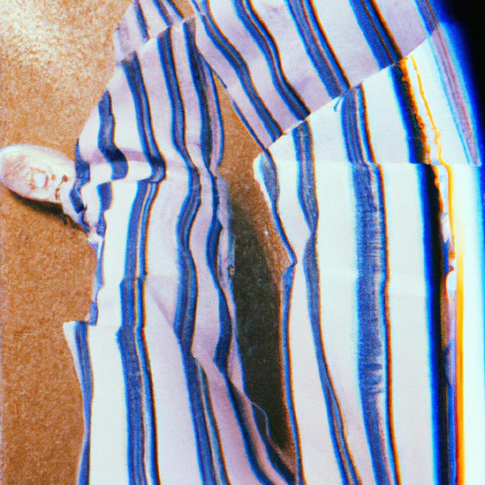
Combining Horizontal and Vertical Patterns
One great way to add interest to an outfit is by mixing horizontal and vertical patterns. For example, pairing a horizontal striped shirt with vertical striped trousers. This creates a look that is stylish and balanced. To make the look even more interesting, mix and match pattern sizes like pairing big polka dots with small gingham check.
Mixing Complementary Colors
Complementary colors, or colors that are opposite each other on the color wheel, are a great way to create visually striking looks. Mixing a bright orange with navy blue or pale pink with green creates a bold ensemble that will surely turn heads. You can also try combining monochromatic colors such as navy, dark blue, and steel gray for a subtle yet eye-catching effect.
Strategies for Mixing Prints of Different Sizes
Mixing prints of different sizes can be tricky, but done correctly, it can create a playful and unique look. Start by building your outfit around one large patterned piece, such as an oversized polka dot dress. To keep the look balanced, pair the dress with a smaller print like a gingham check blouse or a scarf with stripes. Finally, add solid hues such as white or black shoes to finish off the look.
Mixing patterns and colors can be intimidating at first, but with a little practice and creativity, you’ll be able to create fun and stylish outfits that express your unique sense of style. So the next time you’re getting dressed, challenge yourself to mix prints and colors and experiment with different combinations to find something that fits your personal style.
Combining Horizontal and Vertical Patterns
Mixing horizontal and vertical patterns can instantly add an eye-catching effect to your look. It’s important to find a balance when combining the two, as you don’t want one pattern to overpower the other. You can choose two prints that have similar coloring but one horizontal and the other vertical, or pair a bold vertical pattern with a more subtle horizontal print.
When mixing two different patterns, it’s a good idea to separate larger patterns with a solid color, such as white or black, in order to give the combination some cohesion. However, if you’re feeling a bit bolder, try pairing complimentary or clashing colors together to create an even more attention-grabbing effect!
Start by choosing the largest pattern for your look. Have fun with colors and prints that you love, and then introduce small scale patterns that complement the bigger design. Finally, coordinate accessories such as jewelry and scarves to tie everything together.
Mixing complementary colors is a great way to create bold, playful looks that will stand out. Complementary colors are opposite each other on the color wheel and create a high contrast when placed together. For example, pairing red and green, pink and blue, or yellow and purple adds a vibrant and exciting dimension to an outfit. Additionally, wearing different complementary colors can create a stylish monochromatic look that still stands out. Consider adding a colorful scarf or jewelry to bring in complementary colors for a fun look that is sure to turn heads.
Mixing prints of different sizes can be a great way to add visual interest and create playful casual looks. However, it can be a bit tricky to pull off unless you keep in mind certain tips. Firstly, make sure that the prints you are using have similar visual weight so that it doesn’t look unbalanced. You can do this by choosing prints with similar elements such as shapes and motifs or by considering the size of the print relative to the garment.
In addition, look for a contrast of colors when mixing prints. While they don’t all have to be complementary colors, combining two shades that are opposite on the color wheel often works well. For example, if you’re pairing a polka dot top with a striped skirt, blue and yellow are great colors to use together.
You should also try to mix more than two patterns and colors to create an interesting and lively look. Using three or more colors and prints can be surprisingly easy to put together as long as you choose pieces that work well together. Consider using prints with similar colors or visual elements such as stripes and spots.
By keeping these tips in mind, you will be able to mix prints of different sizes and create fun and playful looks that are sure to make a statement!
Putting Together Special Occasion Outfits
Special occasions call for special looks, and it’s the perfect chance to show off your style. It can be intimidating to dress up but the main thing is to have fun with it. Styling outfits for special occasion can be a bit tricky if you are not sure where to start.
Here are some tips to help you create the perfect outfit:
- Build a Monochromatic Look – Creating a monochromatic look is a great way to make an impactful statement. Choose one color and use varying tones and shades of that color to tie the outfit together.
- Introduce Different Textures and Patterns – Adding different textures and patterns can be a great way to add visual interest. Mixing subtle prints, stripes, and florals can give your outfit a unique finish.
- Tips for Polished Layering – Layering pieces with different lengths and textures will give your outfit depth. It’s important to keep in mind what pieces need to be visible so none of your hard work gets lost.
By following these simple tips, you can create an eye-catching and fashionable special occasion outfit that everyone will admire. Have fun with it and enjoy the process of creating fun and playful looks!
A monochromatic look is a great way to make a statement and stand out from the crowd. Monochromatic simply means using different shades of the same color that work well together in an outfit. This creates a sophisticated and elegant look, while also being relatively easy to put together. When creating a monochromatic look, it is important to balance the tones from light to dark. Start with a base layer in a light tone of the chosen color, and then add on layers of slightly darker shades until you are satisfied with your color palette.
It is also important to mix different textures and fabrics to add interest and dimension to your monochromatic look. Begin by combining a solid colored top with patterned bottoms or vice versa. To complete the look, add an accessory in a darker tone of the color for visual impact. You can also create contrast by adding pieces of luxury materials like leather, velvet, or silk. With the right combination of colors, textures, and statement pieces, you will have a fashionable and timeless monochromatic look!
When putting together an outfit for any special occasion, textures and patterns can be an easy way to add interest and dimension. Patterns, like stripes, polka dots, or floral prints, can bring life and energy to an ensemble. Textures can also add depth and contrast, such as adding a smooth silky top to a denim skirt. By mixing different textures and patterns together, you’ll create a unique and eye-catching look.
Start by choosing one base texture, such as a blouse or dress. Then, go for a patterned accessory, like a scarf, hat, or purse. Remember that you don’t have to match the pattern with your base color – try playing with tones and shades, or combine complementary colors for an interesting look. You can also mix in different shapes and lines, such as stripes, checks, or florals. Keep in mind that all pieces should have a similar visual weight, meaning they should be around the same size and design so they don’t overpower each other.
Finally, don’t be afraid to experiment! If you’re feeling daring, try pairing two very different patterns and colors together, or try coordinating your JanSport backpack with different looks. With some practice, you’ll soon be creating stylish and bold statement outfits.
When it comes to layering, the key is in finding the right balance and making sure the colors and patterns in each layer don’t compete with one another. To create a polished look, start with a neutral base layer such as a solid colored shirt or blouse. Then, add a patterned piece like a printed skirt or a fun accessory, like a patterned scarf. Finally, add a third layer that either has the same neutrals as the base layer or picks up on the colors of the second layer for a cohesive look. To achieve the perfect balance, try to pick an outfit where the colors and patterns have similar visual weights and are complementary to each other.
When it comes to crafting a look that truly stands out, stylist tips can help you make a statement. If you’re feeling adventurous, why not try matching your Jansport backpack to your outfit? For an even bolder move, take the all-pattern trend for a spin and mix different prints and patterns together! But, if that still seems a bit too daring for you, try mixing subtle colors instead. This will give you that extra edge without being too much.
With the right attitude, the right techniques, and the right tips – you’ll be able to craft dynamic looks with patterns and colors that are both fun and playful.
Adding the perfect accessory to complete your outfit can be a tricky part of creating a fun and playful look. Fortunately, coordinating a Jansport backpack with your ensemble provides an effortless way to pull off the style effortlessly.
A Jansport backpack is a great option for versatile layering options. Its bright colors and distinctive styles are a great way to add a subtle hint of personality to your casual looks. Whether you opt for an earthy brown tone or go for a bold pop of color, Jansport offers a wide range of colors and designs to choose from.
When it comes to coordinating your Jansport backpack with an outfit, consider the overall color scheme. If you’re wearing a bright patterned shirt, choose a Jansport backpack in a complementary tone like navy blue or charcoal grey. If you’re wearing a mostly monochromatic ensemble, then pick a pair of shoes or a Jansport backpack in a contrasting color. Additionally, pay close attention to the detailing on the backpack. The zippers, straps, and pockets can provide a great opportunity to add metallic finishes or extra patterns for more flair.
In the end, it all comes down to your personal preference and fashion sense. Choosing the right Jansport backpack for your outfit is a great way to show off your fun and playful style without going over the top.
Tips for Pulling Off an All-Pattern Look
Pulling off an all-pattern look might seem intimidating, but it can be done! Here are some tips to help make it successful:
- Start with a neutral base. Select a solid color base for your outfit, and then layer patterns on top of it. This will help ground the look and keep it from getting too chaotic.
- Choose colors that work together. When selecting patterns, make sure they share at least one color in common. That shared element will tie the look together and create a sense of cohesion.
- Vary the scale of the patterns. Using patterns of different sizes is a great way to create visual interest. Just make sure that there is a balance between large and small patterns.
- Experiment with mixing textures. Combining several different types of fabric (e.g., cotton, wool, velvet, satin) can add depth and dimension to the look.
- Add metallic accents. A touch of metallics (e.g., gold, silver, bronze) can add shine to the look and draw attention to the patterns.
With the right combination of fabrics and colors, you can create an exciting all-pattern look that is sure to impress!
When adding subtle color combinations to your look, there are a few things to consider. It can be helpful to start with the basics of color theory, such as how to create a harmonious palette and understanding the difference between tones and shades. Another important factor is choosing patterns and colors that have visual weights that match, as well as contrasting colors.
Once you have the basics down, you can start to layer multiple prints and colors together. When doing this, it can be helpful to think about combining different types of patterns, like horizontal and vertical stripes, and complementary colors. You should also incorporate prints and colors of different sizes, to make sure that your outfit looks balanced.
For special occasions, choosing a solid or monochromatic color scheme can be a good place to start. To make the look more interesting, you can introduce different textures and patterns, while still keeping a cohesive theme. Layering these pieces will help you get a polished look.
Finally, if you’re looking for something more daring, you can experiment with combining bolder patterns and colors. For instance, you could pair a printed Jansport backpack with an entirely patterned outfit. Alternatively, you could add subtle touches with tonal colors. By using these tips, you can create fresh and unique looks!
VII. Summary (200 Words)
In this guide, you have gained a better understanding of mixing patterns and colors to create fun and playful casual looks. You have learned about the basics of color theory and how to choose patterns and colors that complement one another. Additionally, you have discovered tips for putting together playful looks for special occasions and stylist tips for making a statement.
By considering the principles explored in this guide, you should now be well-equipped to select patterns and colors that are complementary to one another, creating looks that are fashionable, confident, and polished.
To summarize, the key take-away from this guide is: when mixing patterns and colors, it’s important to think of the bigger picture. Consider the overall harmony and contrast of the colors and textures, as well as their visual weight. With a few simple guidelines, you’ll be able to create stylish looks with ease!
In this guide, we discussed the basics of colors, mixing patterns, creating playful looks for everyday wear, and adding the perfect touches for special occasions. We have gone over the importance of studying the principles of color theory to create harmonic color palettes, learning how to combine patterns with similar visual weights, and understanding the rules of contrast.
We also shared tips for combining horizontal and vertical patterns, mixing complementary colors, and layering different textures and patterns. To top it off, we discussed ways to make a statement by coordinating accessories, including the popular Jansport backpack, with your outfit.
By taking the time to learn the basics of combining patterns with colors, you can create looks that are both fun and stylish. Remember to take into consideration the importance of visual weight, the impact of contrasting colors, and the beauty of adding subtle accents throughout your outfit. Once you get the hang of it, you’re sure to stand out from the crowd!
Mixed patterns and colors are the best way to create fun and playful looks for any occasion, whether formal or casual. With a little understanding of color theory and good style tips, it’s easy to pull off a great look with a few simple steps. Start by understanding the basics of color theory to create a harmonious color scheme and identify the contrast between colors. You should also consider factors such as the visual weight of each pattern and know when to mix more than two patterns and colors.
Once you understand the basics, you can move on to more complicated looks. Combining horizontal and vertical patterns, mixing complementary colors and combining prints of different sizes are all useful tips to make a bold statement. When styling special occasions, incorporate textures and monochromatic color schemes to achieve a polished layered look. Finally, add finishing touches like coordinating your JanSport backpack with an outfit or adding subtle color combinations to make a real statement.
By taking the time to learn the basics of mixing patterns and colors, you will have the knowledge needed to style any look for any occasion. Whether you’re looking for a fun and playful casual look or a sophisticated special occasion outfit, you can make sure that your outfit stands out in the crowd!
Introduction
Mixing patterns and colors can be an intimidating task. But with a bit of knowledge about color theory and its basics, you can easily create casual looks that are both fun and playful. The following guide will provide you with a comprehensive overview of mixing patterns and colors, plus essential tips for putting together special occasion outfits that make a statement.
Basics of Color Theory
Before you start mixing patterns and colors, understanding how to create a harmonic color scheme is essential. To create an aesthetically pleasing combination, it is important to consider the contrast of tones and shades. In this section, we will explore the basics of color theory and discuss some key tips for choosing the right patterns and colors.
How to Put Together Playful Looks
One of the best ways to spruce up your wardrobe is by mixing different patterns and colors. Mixing colors horizontally and vertically can give your outfits extra depth and dimension. Combinations of complementary colors can make your look pop. Plus, there are strategies for mixing prints of different sizes, which can really help you create a playful look.
Putting Together Special Occasion Outfits
If you want to look polished and put-together for special occasions, layering is the key. Building a monochromatic look can make a sleek and sophisticated statement. Incorporating different textures and patterns can add visual interest. Our guide offers some tips to help you ace the art of layering and create a head-turning outfit.
Stylist Tips for Making a Statement
Adding subtle details such as coordinating your JanSport backpack with an outfit or pulling off an all-pattern look can take your outfits to the next level. In this section, we will give you some tips for making a statement with the way you dress.
Summary
In this guide, we explored the basics of color theory, tips for choosing the right patterns and colors, strategies for putting together playful looks, tips for creating special occasion outfits, and some stylist tips for making a statement. We hope the information in this guide has given you the confidence to start experimenting with patterns and colors.
comments: 0
